We Looked At Every Winery Website in Sonoma
We analyzed Sonoma winery websites across 18 key metrics and uncovered major trends in design, e-commerce, amenities, and more. Whether you’re a wine lover or industry pro, our findings reveal how digital innovation is shaping one of America’s most prestigious wine regions.
Published by Andrew Means
June 27, 2024

What is the state of Winery Websites in Sonoma?
We surveyed every winery website in Sonoma across 18 unique metrics, from site performance to brand expression, amenities, commerce platforms, and more. What we found gave us unique insight into the state of wine marketing in one of America’s most prestigious regions.
Top-line takeaways? Sonoma wineries have invested more (and more recently) in their websites than in other regions, with markedly higher performance metrics and more capable and sophisticated e-commerce platforms.
However, e-commerce is sorely underdeveloped, with most e-commerce experiences decades behind contemporary standards.
Aesthetically, Sonoma’s winery websites generally boast higher quality photography and design, with more sites scoring higher in brand expression and photography.
Sonoma Wineries are also responding to current desires for more than just a tasting experience, bolstering their offerings with a variety of amenities such as food and wine pairings, art & architecture, and outdoor dining.
Read on for more details, or click here to access the raw data and see your winery’s full report.
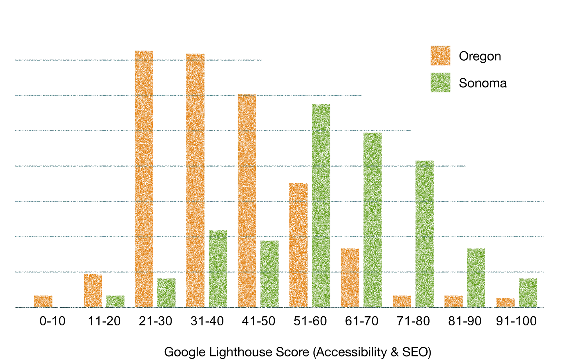
1. Sonoma winery websites are significantly faster than Oregon’s
Where Oregon winery website scores averaged around 20-30, Sonoma websites are significantly quicker, likely due to newer and better-maintained sites.
Still, the most common score of 50-60 leaves plenty of room to grow in terms of performance for the region. Numerous studies have shown clear correlation between as little as .1 second of site speed and significant increases in conversion rates and sales.
Especially with the higher price point of wine, it’s likely that millions of dollars are being left on the proverbial table.
2. E-Commerce is still 10 years behind other industries.
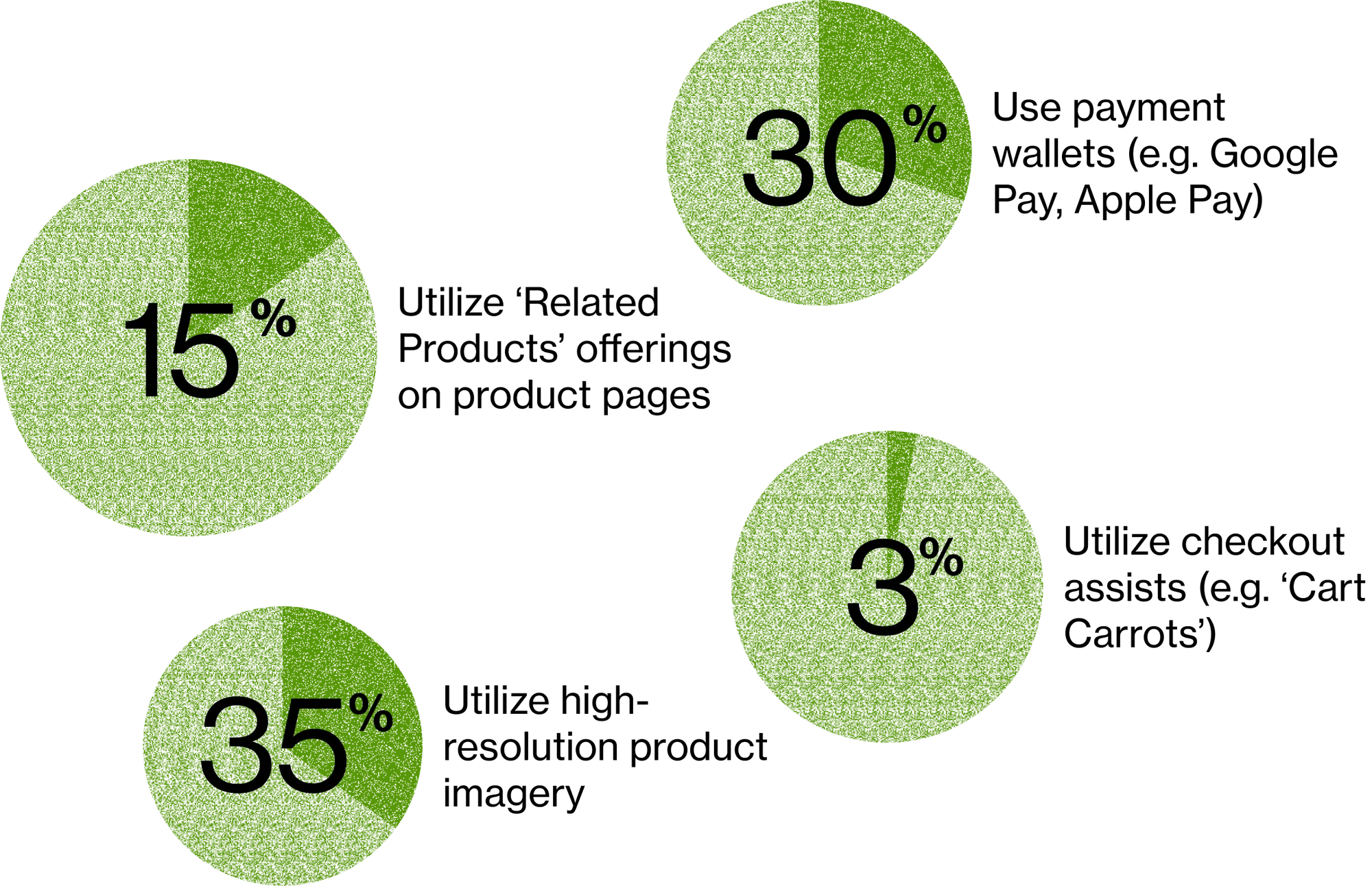
While Sonoma websites are generally equipped with capable commerce platforms, scant few are taking advantage of the advances in e-commerce in the past decade.
Simple, proven e-commerce practices like related products, cart carrots, alternative payment methods (Google Pay, Apple Pay) and even high-resolution product imagery are sorely underutilized.
This underinvestment of platforms that have all of these capabilities belies a pessimism about the potential of online sales. Certainly complications like shipping and convoluted regulatory oversight serve as headwinds, yet we know online sales can be successful component of a winery’s DTC strategy. When will wineries adapt?
3. Wine tasting is more than just wine (and Sonoma likes dogs more than kids)
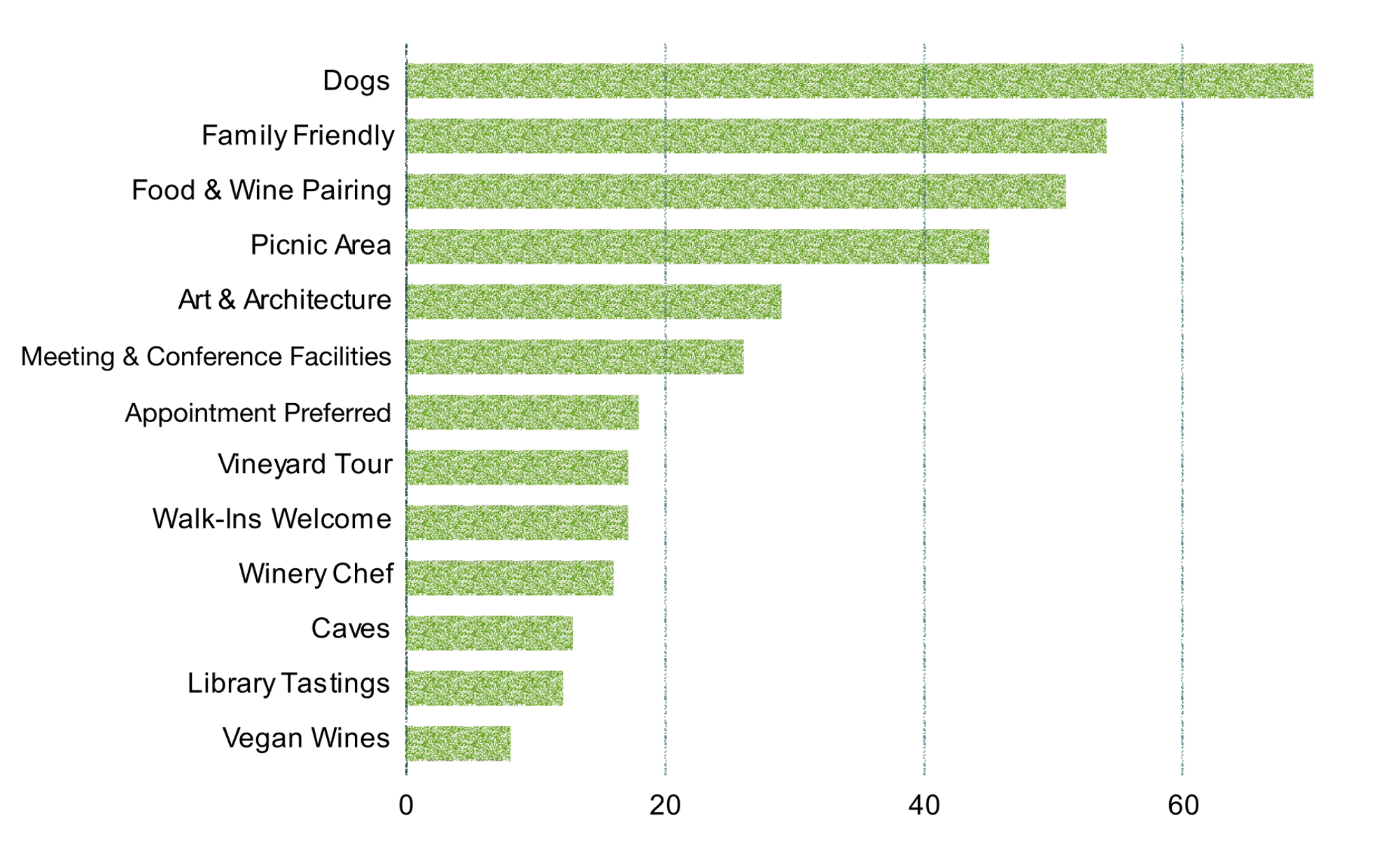
Understanding that visitors want more than just to taste some wine, winery websites are quick to offer additional amenities to enhance a tasting-room experience. A survey of available amenities showed ‘dog-friendly’ at the top of the heap (comfortably ahead of ‘family friendly’), but there were no shortage of perks, including vineyard tours, on-site chefs, and even caves.
4. Commerce7 has pulled ahead of WineDirect
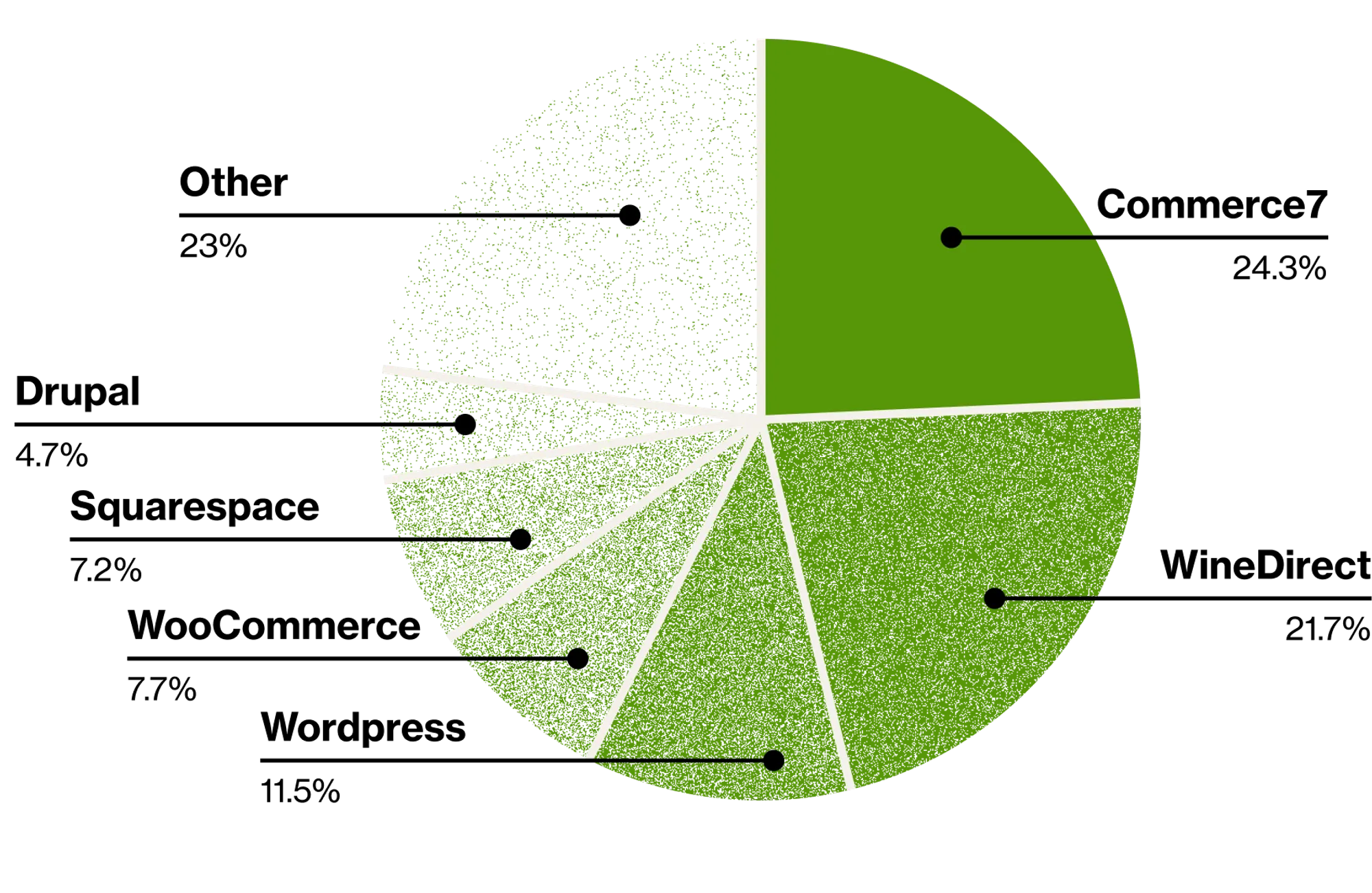
Commerce7 has unseated WineDirect as the most popular e-commerce platform in Sonoma. Generic WordPress platforms and WordPress WooCommerce make up a large category of websites without a wine-specific e-commerce platform. OrderPort, popular in Oregon and Washington, is nonexistent here.
Other common platforms included VinoShipper and Squarespace, which both peaked in the 20-40 range, and Wordpress & WooCommerce, which showed relatively wide score distributions.
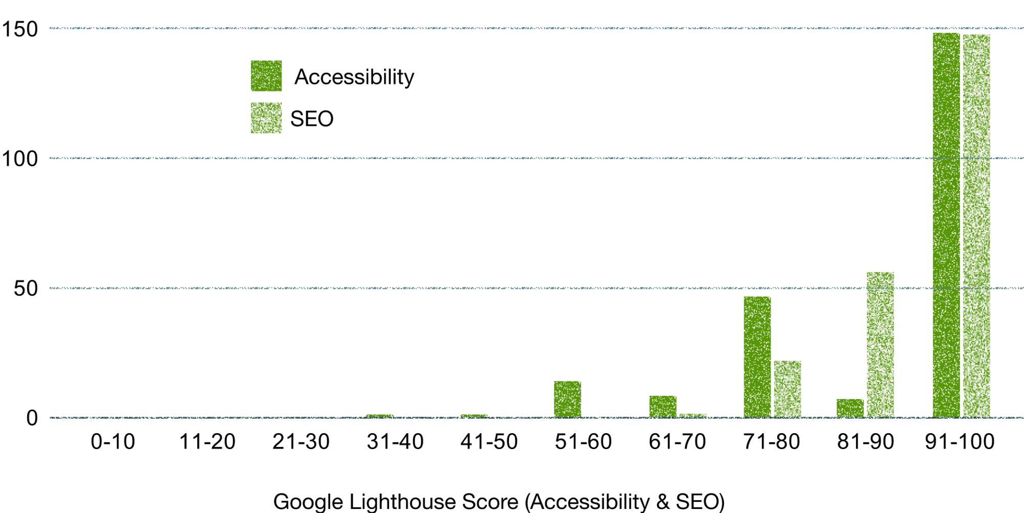
5. Sonoma boasts high Accessibility and SEO scores
Continuing the trend of newer, higher-performing websites, Sonoma websites score very high in Google’s Accessibility metric and SEO scores.
6. Chardonnay and Pinot Noir are Queen & King
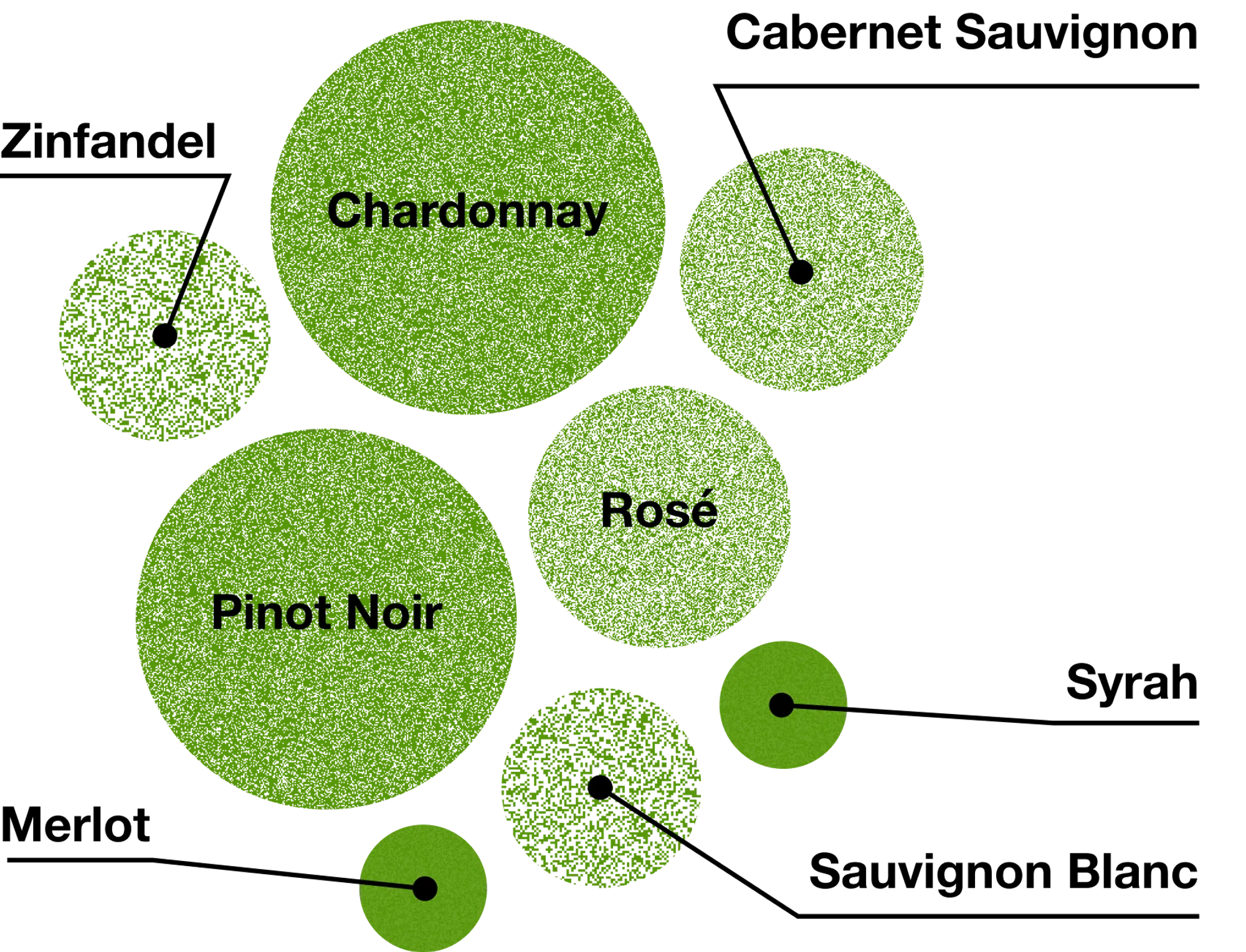
Sonoma winery websites showcase Pinot Noir and Chardonnay more than any other grape. No surprise there—Sonoma is known worldwide for these grapes. However the fact that Rosé-style wines beat out varietals like Cabernet Sauvignon and Zinfandel speaks to the continued popularity and versatility of the method.
7. Tasting room & reservation links were common, but half of wineries don’t have trade information
Spec sheets, bottle shots, etc. are important for trade professionals, but many wineries still don’t make these resources easy to find.
Most websites had easy-to-find information on their tasting rooms (up from 76% in Oregon), and reservation links are ubiquitous, showing the era of walk-ins is well and truly behind us.
However we wonder what, if any, impact this has on overall tasting room numbers. How many fewer people are heading out into wine country when the option of the on-a-whim visit is largely removed?

What Now?
This study comes at a time when wineries across the country are struggling with poor tasting room numbers, declining retail sales, and shrinking wine clubs.
While near term economic considerations are certainly influencing this reality, we believe we’re also seeing an industry that needs help adapting to a new generation of drinkers’ habits, values, and aspirations, which include substantially different expectations about how companies are discovered by, interact with, and sell to their customers.
Wineries that grow and flourish in this evolving environment will do so through unique, relevant branding, strong digital engagement with their customers, and websites that are treated like the revenue driver they can be.
Want to see how your winery scored?
Access the database and request your full report here.
Curious about something you’ve read here? Got questions about methodology, want more detail, or just want to chat? Email us at inquiries@transom.design.